
Autumn… probably my favorite season.
Seriously, what can be better than going on a foggy walk, just to return home for a marathon of scary movies, or staying indoors, reading a good book while burning your favorite candles and listening to the rain outside.
The Fall season can be so much fun! But what I love most about it is how colorful it is!
However, my Instagram feed has a lot of blue, so I want to change it to a warmer tone for the new season.
I shared how I edit my photos for Instagram in a new Youtube video, and below, you’ll find all the Lightroom settings I used for you to create the same look:
Lightroom Settings to get this look:
Custom:
Temp: +9
Tone:
Exposure: +0,50
Contrast: +6
Highlights: -100
Shadows: +2
Whites: -59
Blacks: -6
Presence:
Texture: -9
Clarity: +18
Vibrance: +12
HSL/Color:
Red:
Hue: +28
Saturation: +28
Luminance: 0
Orange:
Hue: -19
Saturation: -17
Luminance: -6
Yellow:
Hue: -55
Saturation: -43
Luminance: -24
Green:
Hue: -73
Saturation: -29
Luminance: -14
Aqua:
Hue: +51
Saturation: +42
Luminance: +29
Blue:
Hue: +16
Saturation: +19
Luminance: +43
Calibration:
Shadows:
Tint: -1
Red Primary:
Hue: -12
Saturation: -5
Green Primary:
Hue: +58
Saturation: +20
Blue Primary:
Hue: +10
Saturation: 0
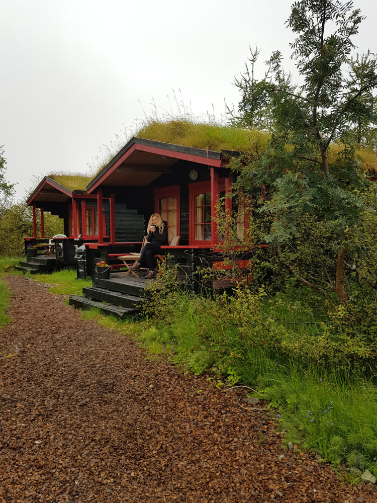
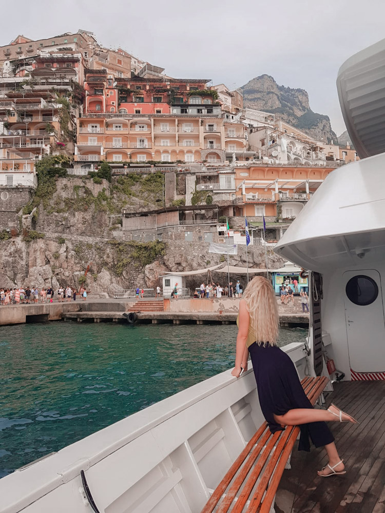
Here are some Before/After Photos:
The plan was to create a soft autumn peachy look so that I can transition to darker colors in the future.


Check some ideas on how to take better travel photos, and receive a free preset.
Stay tuned for more preset Ideas like this one.
xo
Claudia
Pin it:


Leave a comment